
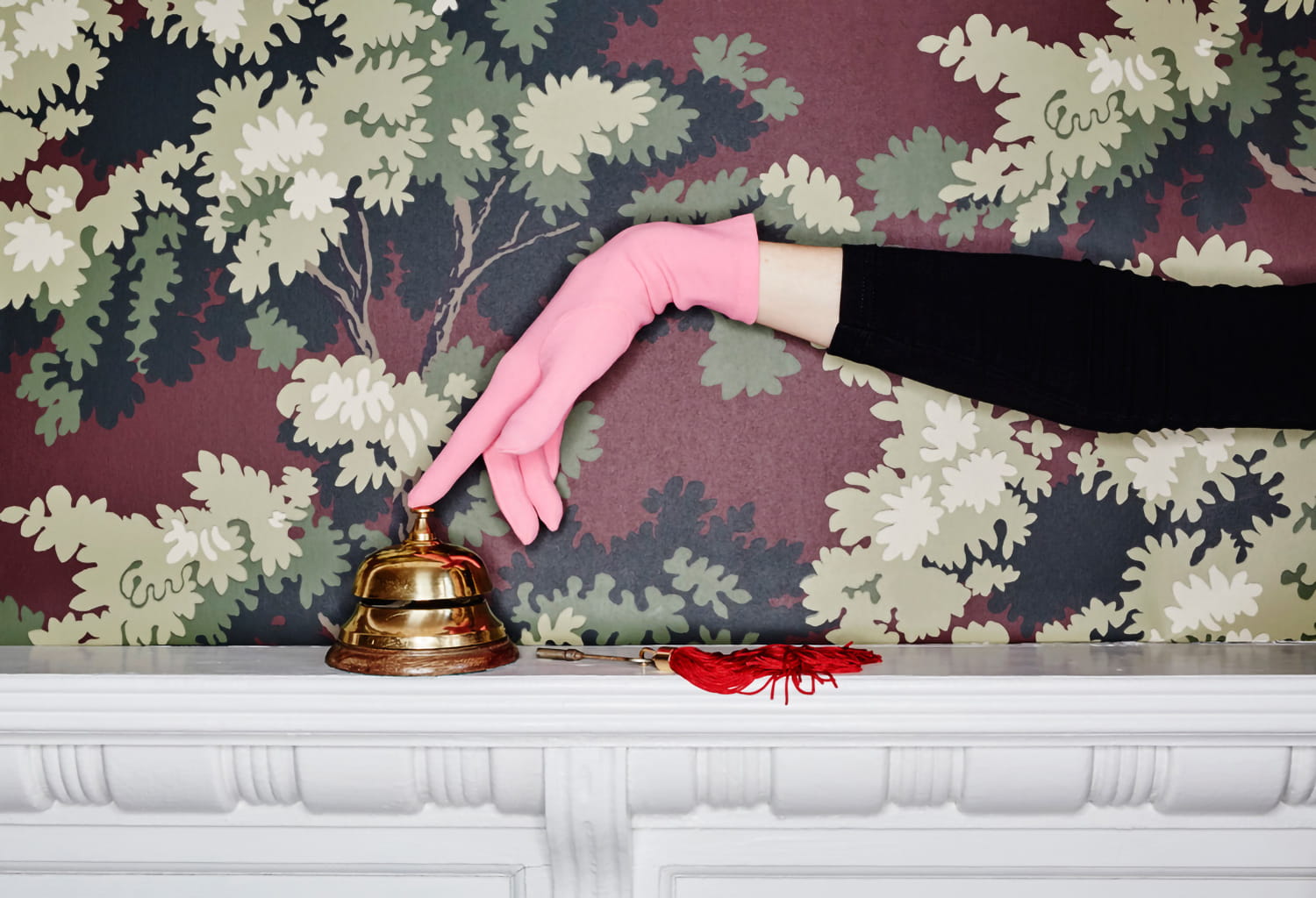


Since the late 19th century, hotels have been regarded as places of longing and inspiration for creatives, thinkers, and intellectuals. To this day, they remain places where people relax while observing the world around them and drawing inspiration from it. Over the course of more than a century, a distinct hotel interior style has emerged. In recent years, elements and atmospheres from the hospitality industry have increasingly found their way into private living spaces. Whether it is the classic luxury hotel look, minimalist Scandinavian design, or the interior concepts of eclectic boutique hotels, luxurious simplicity, relaxed sophistication, and understated yet high-quality comfort work just as well at home.
Before discussing specific styles, however, it is worth taking a closer look at the underlying principles. Hotel interior design is a discipline of its own, shaped by experts such as Pierre-Yves Rochon, Kit Kemp, and Ilse Crawford. Despite their different approaches, they all follow surprisingly concrete rules that serve one goal: ensuring that a guest enters a room they have never seen before and feels comfortable within fifteen seconds. Anyone who understands these principles can apply them at home as well.
The Fundamental Principles: What Hotel Designers Do Differently
The Threshold Moment
Hotel rooms are designed from the perspective of someone entering through the door. The first thing a guest sees should never be the wardrobe but the most appealing view in the room. Another principle is darkness before light. Hotel corridors are intentionally subdued so that the room feels more spacious upon entry. A hallway featuring patterned wallpaper in muted tones is therefore not wasted space but preparation for the rooms beyond.

Zones Instead of Rooms
A standard hotel room often measures little more than twenty square meters, yet it still feels complete because every function, sleeping, storing belongings, working, and relaxing, is assigned a clearly defined place and its own lighting. Wall design is the most elegant tool for achieving this because it does not take up any floor space.
One Wall Takes the Lead
There is exactly one dominant element within each sightline, almost always the headboard wall, while the remaining surfaces take a supporting role. At home, this means placing the statement wallpaper on a single wall and choosing a colour for the others that picks up a subtle tone from the pattern.
Layered Lighting
Hospitality designers work with at least three layers of light: soft ambient lighting that is never positioned directly above the bed, individually switchable reading lights on both sides of the bed, and accent lighting highlighting walls or artwork. The light should remain warm, between 2,200 and 2,700 Kelvin, and the light source itself should stay out of sight. Light that grazes a wall makes spaces appear larger and brings embossed surfaces and textiles to life.
A Sense of Security Behind You
People instinctively seek places where their backs feel protected while they maintain a view of the room. In hotel lobbies, the secluded seating areas are always occupied first. Where a large upholstered headboard is not possible, the wall can take over this role. A darker or textured surface behind the bed creates the same reassuring sense of support.

The Touch Test
Upscale hotels invest in the areas guests physically interact with most: door handles, light switches, and bed linens. Walls are also points of contact, which is why textile wallpapers, silk finishes, and delicate embossing play such an important role. Another key principle is contrast. Every room should feature at least one noticeable material contrast, rough against smooth, matte against glossy.
The Calm of a Limited Palette
Hotel projects are guided by material boards during the planning stage, and these rarely contain more than five to seven materials and three to four colors. At home, you can adopt the hotel design rule of a 60-30-10 distribution between a dominant colour, a secondary colour, and an accent colour, as well as the rule of three: every colour should appear at least three times throughout the space.
What You Do Not See and the One Rule to Break
The strongest subconscious influences are acoustics, order, and scent. A room with no echo thanks to textile wall coverings and carpets is perceived as more luxurious. In hotel rooms, nothing is visible unless it has been intentionally designed. To avoid a sterile atmosphere, good designers usually incorporate one deliberate contradiction: an antique armchair in an otherwise minimalist room, or a neon sign on an otherwise understated wall. These principles apply across all styles. How they feel depends on the hotel style chosen.
The Classic Luxury Hotel Style
The classic luxury hotel style, which was developed for hotels such as the Ritz in Paris as early as the late 19th century, is defined by timeless elegance. Muted colours are characteristic and are often paired with gold or silver accents.
Materials such as velvet, silk, leather, marble, and dark wood lend the interior a luxurious touch. Furniture and accessories are classic, yet often opulent. Large beds with upholstered headboards and chandeliers are key features of this look.
Wallpaper choices for this style include damask designs, classic botanical patterns, and subtle embossed textures. Silk and fabric wallpapers add an extra layer of sophistication and tactile appeal. Suitable colour palettes include beige, cream, navy blue, burgundy, and gold, creating a warm, luxurious atmosphere with a hint of tradition.

The Modern Hotel Style
The modern hotel style, which emerged in the early 2000s, is characterized by minimalism, clean lines, and understated elegance. Instead of opulent details, it focuses on reduced forms and functional aesthetics. Examples can be found in renowned design hotels such as The Standard and Aman Resorts.
Materials like glass, metal, concrete, and light wood dominate, complemented by subtle fabrics that create a restrained yet welcoming atmosphere. Furniture usually consists of sleek designer pieces that stand out through their form rather than ornamentation. Large windows allow abundant natural light, while indirect lighting is typically used after dark to create targeted accents throughout the room.
For interiors in the modern hotel style, smooth non-woven wallpapers and wallpapers with subtle textures work particularly well. Patterns should remain minimalist, featuring geometric shapes, monochrome appearances, or concrete and wood effects. Grey, white, black, and earthy tones are ideal choices. Together, they create calm, clean lines and modern elegance with a refined sense of understatement.


The Boutique Hotel Style
The boutique hotel style is defined by an individual and creative interior design approach that blends vintage and bohemian influences. Boutique hotels rely on unique design concepts that clearly distinguish them from traditional hotel interiors.
Unconventional combinations of wood, rattan, velvet, and boldly patterned fabrics are typical, giving rooms an inviting and highly personal character. Furniture often consists of a mix of vintage one-of-a-kind pieces, designer chairs, and playful accessories.
A boutique hotel always tells a story. At home, this can be expressed through heirlooms, travel souvenirs, and flea market finds, items with a history rather than mass-produced decoration. To keep the overall look from becoming chaotic, a restrained colour palette remains important here as well. Three consistently repeated colours can unify even the most eclectic furniture mix.
Statement non-woven wallpapers, textile wallpapers, or vintage-inspired wallpapers are particularly suitable. Jungle prints, botanical motifs, and artistic patterns fit perfectly within this style. Colour choices may range from bold accents to warm pastels or rich shades such as emerald green and mustard yellow.


The Scandinavian Hotel Style
The understated yet inviting character that defines Northern European interior design is also reflected in Scandinavian hotels.
To recreate this style, minimalist non-woven wallpapers in light colours are ideal, featuring delicate geometric or botanical patterns, stripes, or wood effects. Suitable colours include white, light grey, beige, and soft shades of blue and green. Together, they create the bright, airy atmosphere for which Scandinavian interiors are known, while still conveying warmth and comfort.

The Urban Loft Hotel Style
Hotels inspired by the urban loft aesthetic make sophisticated use of industrial design. Properties such as the Ace Hotel in New York and the various Soho House locations have shaped this look: spaces that appear discovered rather than designed, with exposed pipes, worn leather armchairs, and artwork leaning against walls instead of hanging from them.
This effect, however, is carefully orchestrated. To prevent raw spaces from feeling uncomfortable, designers balance the hard architectural shell with soft textiles for better acoustics, warm and low-hanging light sources, and clearly defined zones. The sense of protection behind one's back is especially important here. In a large open space, every seating and sleeping area requires a backdrop; otherwise, it feels incomplete. A wallpapered surface can effectively replace this missing wall.
Suitable wallpapers include concrete or brick effects, metallic finishes, or leather-look surfaces. Patterns can be subtle or deliberately raw and irregular. The colour palette ranges from dark shades such as anthracite and black to dark brown and brick red.

The Tropical Resort Style
Inspired by hotels on Southeast Asian islands such as Bali, this style is defined by warm natural materials and handcrafted furniture made from woven fibers.
To recreate this look in private bedrooms, natural-fiber wallpapers made from bamboo or sisal are excellent choices. Palm designs, botanical motifs, and jungle prints are ideal pattern options. Earth tones, shades of green, and soft blues complete the relaxing, natural, and subtly exotic atmosphere.


The French Château Style
The style of French château hotels is distinguished by opulent furniture and wall coverings enriched with a sense of patina and history.
Suitable wallpaper options include silk wallpapers, fabric-look wallpapers, and wallpapers with more pronounced embossing. Classic ornamental designs, floral motifs, and decorative borders work particularly well. Pastel shades, gold, warm off-white tones, and blush pink reinforce the romantic, opulent, and luxurious character of this style.

The Formula for your Home
Whether classically elegant, minimalist and modern, or playfully creative, the variety of hotel styles is inspiring an increasing number of living spaces. Anyone who wants to bring the feeling of a great hotel room home needs less budget than method: plan from the doorway, think in zones, let one wall take the lead, divide the lighting into at least three warm layers, give the bed or sofa a sense of backing and protection, limit the palette to three colors and repeat each of them at least three times and, finally, allow yourself one deliberate break from the rules.
Wallpaper and colour play a central role in recreating the atmosphere of a luxurious, welcoming, and stylish interior at home.

Author: Robin Kreide